將尺寸表新增至產品頁面
如果您銷售的服飾品項需要顧客在購買前先瞭解他們自己的尺寸,則可以在商品頁面新增自訂尺寸表。
所有需要參考尺寸表的商品都必須有尺寸選項: 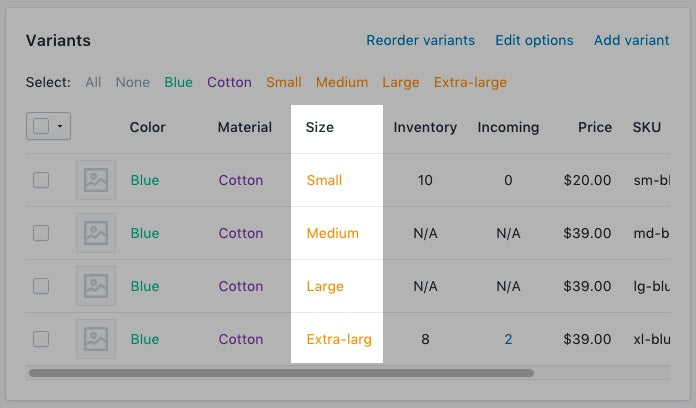
此頁面上
建立尺寸表頁面
- 從 Shopify 管理介面 中,前往「線上商店 > 頁面」。
- 按一下「新增頁面」。
-
輸入頁面標題。
- 如果要建立顯示於全網站範圍的尺寸表,請輸入「
Size Chart」作為頁面標題。在「搜尋引擎產品資訊預覽*」區段,頁面的網址結尾應為/size-chart。 - 如果要建立僅會顯示於特定廠商產品上的圖表,請輸入廠商名稱,然後輸入
Size Chart。
舉例而言,如果您的廠商名稱為 Great Owls,則請將頁面標題輸入為Great Owls Size Chart。在「搜尋引擎產品資訊預覽」區段,頁面的網址結尾應為/great-owls-size-chart。 - 如果要建立僅會顯示於特定產品類型的圖表,請輸入產品類型,然後輸入
Size Chart。
舉例而言,如果您想要顯示鞋類專用尺寸表,則請將頁面標題輸入為Shoes Size Chart。在「搜尋引擎產品資訊預覽」區段,頁面的網址結尾應為/shoes-size-chart。
- 如果要建立顯示於全網站範圍的尺寸表,請輸入「
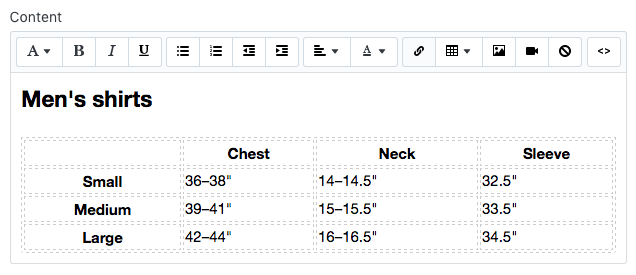
在「內容」方塊中,建立一個包含尺寸表資訊的表格。自訂表格以按照您想要的方式顯示:
在「可見性」區段,請確認頁面已設為「公開」。
點擊「儲存」。
- 在 Shopify 應用程式中,點選「…」按鈕。
- 在銷售管道畫面上,點一下「線上商店」。
- 點一下「頁面」。
- 按一下「新增頁面」。
-
輸入頁面標題。
- 如果要建立顯示於全網站範圍的尺寸表,請輸入「
Size Chart」作為頁面標題。在「搜尋引擎產品資訊預覽*」區段,頁面的網址結尾應為/size-chart。 - 如果要建立僅會顯示於特定廠商產品上的圖表,請輸入廠商名稱,然後輸入
Size Chart。
舉例而言,如果您的廠商名稱為 Great Owls,則請將頁面標題輸入為Great Owls Size Chart。在「搜尋引擎產品資訊預覽」區段,頁面的網址結尾應為/great-owls-size-chart。 - 如果要建立僅會顯示於特定產品類型的圖表,請輸入產品類型,然後輸入
Size Chart。
舉例而言,如果您想要顯示鞋類專用尺寸表,則請將頁面標題輸入為Shoes Size Chart。在「搜尋引擎產品資訊預覽」區段,頁面的網址結尾應為/shoes-size-chart。
- 如果要建立顯示於全網站範圍的尺寸表,請輸入「
在「內容」方塊中,建立一個包含尺寸表資訊的表格。自訂表格以按照您想要的方式顯示:
在「可見性」區段,請確認頁面已設為「公開」。
點擊「儲存」。
導覽至程式碼編輯器
- 在 Shopify 管理介面 中,前往「線上商店」>「佈景主題」。
- 找到要編輯的佈景主題,按一下「...」按鈕以開啟動作選單,然後點擊「編輯程式碼」。
- 在 Shopify 應用程式中,點選「…」按鈕。
- 在銷售管道畫面上,點一下「線上商店」。
- 點一下「管理佈景主題」。
- 找到要編輯的佈景主題,按一下「...」按鈕以開啟動作選單,然後點擊「編輯程式碼」。
- 在 Shopify 應用程式中,點選「…」按鈕。
- 在銷售管道畫面上,點一下「線上商店」。
- 點一下「管理佈景主題」。
- 找到要編輯的佈景主題,按一下「...」按鈕以開啟動作選單,然後點擊「編輯程式碼」。
選擇下列其中一項,然後建立尺寸表程式碼片段
建立尺寸表程式碼片段
- 在「程式碼片段」目錄中,按一下「新增程式碼片段」。
將程式碼片段命名為
size-chart,然後點擊「建立程式碼片段」:將下列內容複製到您的
size-chart程式碼片段中:
<div class="pop-up-modal">
<div class="pop-up-content">
<span class="close-button">×</span>
<span class="size-chart-content">{{ pages.size-chart.content }}</span>
</div>
</div>
<script>
const modal = document.querySelector('.pop-up-modal');
const trigger = document.querySelector('.trigger-pop-up');
const closeButton = document.querySelector('.close-button');
function toggleModal() {
modal.classList.toggle('show-pop-up');
}
function windowOnClick(event) {
if (event.target === modal) {
toggleModal();
}
}
trigger.addEventListener('click', toggleModal);
closeButton.addEventListener('click', toggleModal);
window.addEventListener('click', windowOnClick);
</script>
<style>
.pop-up-modal {
position: fixed;
left: 0;
top: 0;
width: 100%;
height: 100%;
background-color: rgba(0, 0, 0, 0.5);
opacity: 0;
display: none;
transform: scale(1.1);
transition: visibility 0s linear 0.25s, opacity 0.25s 0s, transform 0.25s;
overflow:auto;
}
.pop-up-content {
position: absolute;
top: 8%;
left: 50%;
transform: translate(-50%, 0);
background-color: white;
padding: 1rem 1.5rem;
width: auto;
border-radius: 0.5rem;
}
.pop-up-content table {
table-layout: auto;
}
.close-button {
float: right;
width: 1.5rem;
line-height: 1.5rem;
text-align: center;
cursor: pointer;
border-radius: 0.25rem;
background-color: lightgray;
}
.close-button:hover {
background-color: darkgray;
}
.show-pop-up {
z-index: 12;
opacity: 1;
display: block;
transform: scale(1);
transition: visibility 0s linear 0s, opacity 0.25s 0s, transform 0.25s;
}
.trigger-pop-up {
margin: 10px 0 10px 0;
width: 100%;
}
@media only screen and (max-width: 749px) {
.pop-up-content,
.size-chart-content table {
width: 100%;
}
.size-chart-content th,
.size-chart-content td {
padding: 10px;
}
}
</style>{% block "note" %} 需要對 Simple 和 Minimal 佈景主題的 CSS 樣式進行些許變更。{% endblock %}
如果您使用的是 Simple 佈景主題,請使用此程式碼:
<div class="pop-up-modal">
<div class="pop-up-content">
<span class="close-button">×</span>
<span class="size-chart-content">{{ pages.size-chart.content }}</span>
</div>
</div>
<script>
const modal = document.querySelector('.pop-up-modal');
const trigger = document.querySelector('.trigger-pop-up');
const closeButton = document.querySelector('.close-button');
function toggleModal() {
modal.classList.toggle('show-pop-up');
}
function windowOnClick(event) {
if (event.target === modal) {
toggleModal();
}
}
trigger.addEventListener('click', toggleModal);
closeButton.addEventListener('click', toggleModal);
window.addEventListener('click', windowOnClick);
</script>
<style>
.pop-up-modal {
position: fixed;
left: 0;
top: 0;
width: 100%;
height: 100%;
background-color: rgba(0, 0, 0, 0.5);
opacity: 0;
display: none;
transform: scale(1.1);
transition: visibility 0s linear 0.25s, opacity 0.25s 0s, transform 0.25s;
overflow:auto;
}
.pop-up-content {
position: absolute;
top: 8%;
left: 50%;
transform: translate(-50%, 0);
background-color: white;
padding: 1rem 1.5rem;
width: auto;
border-radius: 0.5rem;
}
.pop-up-content table {
table-layout: auto;
}
.close-button {
float: right;
width: 1.5rem;
line-height: 1.5rem;
text-align: center;
cursor: pointer;
border-radius: 0.25rem;
background-color: lightgray;
}
.close-button:hover {
background-color: darkgray;
}
.show-pop-up {
z-index: 12;
opacity: 1;
display: block;
transform: scale(1);
transition: visibility 0s linear 0s, opacity 0.25s 0s, transform 0.25s;
}
.trigger-pop-up {
margin: 10px 0 10px 8px;
width: 50%;
}
@media only screen and (max-width: 749px) {
.pop-up-content,
.size-chart-content table {
width: 100%;
}
.size-chart-content th,
.size-chart-content td {
padding: 10px;
}
.trigger-pop-up {
width: 100%;
}
}
</style>如果您使用的是 Minimal 佈景主題,請使用下列程式碼:
<div class="pop-up-modal">
<div class="pop-up-content">
<span class="close-button">×</span>
<span class="size-chart-content">{{ pages.size-chart.content }}</span>
</div>
</div>
<script>
const modal = document.querySelector('.pop-up-modal');
const trigger = document.querySelector('.trigger-pop-up');
const closeButton = document.querySelector('.close-button');
function toggleModal() {
modal.classList.toggle('show-pop-up');
}
function windowOnClick(event) {
if (event.target === modal) {
toggleModal();
}
}
trigger.addEventListener('click', toggleModal);
closeButton.addEventListener('click', toggleModal);
window.addEventListener('click', windowOnClick);
</script>
<style>
.pop-up-modal {
position: fixed;
left: 0;
top: 0;
width: 100%;
height: 100%;
background-color: rgba(0, 0, 0, 0.5);
opacity: 0;
display: none;
transform: scale(1.1);
transition: visibility 0s linear 0.25s, opacity 0.25s 0s, transform 0.25s;
overflow:auto;
}
.pop-up-content {
position: absolute;
top: 8%;
left: 50%;
transform: translate(-50%, 0);
background-color: white;
padding: 1rem 1.5rem;
width: auto;
border-radius: 0.5rem;
}
.pop-up-content table {
table-layout: auto;
}
.close-button {
float: right;
width: 1.5rem;
line-height: 1.5rem;
text-align: center;
cursor: pointer;
border-radius: 0.25rem;
background-color: lightgray;
}
.close-button:hover {
background-color: darkgray;
}
.show-pop-up {
z-index: 12;
opacity: 1;
display: block;
transform: scale(1);
transition: visibility 0s linear 0s, opacity 0.25s 0s, transform 0.25s;
}
.trigger-pop-up {
margin: 10px 0 10px 0;
width: 100%;
}
@media only screen and (max-width: 749px) {
.pop-up-content,
.size-chart-content table {
width: 100%;
}
.size-chart-content th,
.size-chart-content td {
padding: 10px;
}
}
@media only screen and (min-width: 750px) {
.trigger-pop-up {
width: 50%;
}
}
</style>將尺寸表程式碼片段新增至 theme.liquid
- 在「版面配置」目錄中,點擊以開啟
theme.liquid檔案。 - 找到結束標籤
</body>。在結束標籤</body>正上方,貼上下列程式碼:
{% if request.page_type == 'product' %}
    {% if product.options contains 'Size' %}
        {% render 'size-chart' %}
    {% endif %}
{% endif %}新增「尺寸表」按鈕
- 在「區段」目錄中,點擊以開啟
product-template.liquid檔案,或者如果沒有product-template.liquid檔案,則開啟product.liquid檔案。 - 在「加入購物車」按鈕上方貼上下列程式碼:
{% if product.options contains 'Size' %}
    <a class="trigger-pop-up btn">See Size Chart</a>
{% endif %}「加入購物車」按鈕開頭通常類似「<button type="submit" name="add"」。如果您商店的營運語言並非英文,請將 See Size Chart 取代為您偏好使用的文字。
product-form.liquid 在 Narrative 佈景主題中,您必須將上述程式碼插入位於「程式碼片段」目錄的
建立尺寸表程式碼片段
- 在「程式碼片段」目錄中,按一下「新增程式碼片段」。
將程式碼片段命名為
size-chart,然後點擊「建立程式碼片段」:將下列內容複製到您的
size-chart程式碼片段中:
{% assign chart = product.type | handleize | append: "-size-chart" %} {% unless
pages[chart].empty? or pages[chart].content == blank %}
<div class="pop-up-modal">
<div class="pop-up-content">
<span class="close-button">×</span>
<span class="size-chart-content">{{ pages[chart].content }}</span>
</div>
</div>
{% endunless %}
<script>
const modal = document.querySelector('.pop-up-modal');
const trigger = document.querySelector('.trigger-pop-up');
const closeButton = document.querySelector('.close-button');
function toggleModal() {
modal.classList.toggle('show-pop-up');
}
function windowOnClick(event) {
if (event.target === modal) {
toggleModal();
}
}
trigger.addEventListener('click', toggleModal);
closeButton.addEventListener('click', toggleModal);
window.addEventListener('click', windowOnClick);
</script>
<style>
.pop-up-modal {
position: fixed;
left: 0;
top: 0;
width: 100%;
height: 100%;
background-color: rgba(0, 0, 0, 0.5);
opacity: 0;
display: none;
transform: scale(1.1);
transition: visibility 0s linear 0.25s, opacity 0.25s 0s, transform 0.25s;
overflow:auto;
}
.pop-up-content {
position: absolute;
top: 8%;
left: 50%;
transform: translate(-50%, 0);
background-color: white;
padding: 1rem 1.5rem;
width: auto;
border-radius: 0.5rem;
}
.pop-up-content table {
table-layout: auto;
}
.close-button {
float: right;
width: 1.5rem;
line-height: 1.5rem;
text-align: center;
cursor: pointer;
border-radius: 0.25rem;
background-color: lightgray;
}
.close-button:hover {
background-color: darkgray;
}
.show-pop-up {
z-index: 12;
opacity: 1;
display: block;
transform: scale(1);
transition: visibility 0s linear 0s, opacity 0.25s 0s, transform 0.25s;
}
.trigger-pop-up {
margin: 10px 0 10px 0;
width: 100%;
}
@media only screen and (max-width: 749px) {
.pop-up-content,
.size-chart-content table {
width: 100%;
}
.size-chart-content th,
.size-chart-content td {
padding: 10px;
}
}
</style>如果您使用 Simple 佈景主題,請將 </style> 右上方的 .trigger-pop-up 取代為此程式碼:
.trigger-pop-up {
  margin: 10px 0 10px 8px;
  width: 50%;
}
@media only screen and (max-width: 749px) {
  .pop-up-content,
  .size-chart-content table {
    width: 100%;
  }
  .size-chart-content th,
  .size-chart-content td {
    padding: 10px;
  }
  .trigger-pop-up {
    width: 100%;
  }
}
如果您使用 Minimal 佈景主題,請將下列程式碼新增至結束標籤 </style> 上方:
@media only screen and (min-width: 750px) {
  .trigger-pop-up {
    width: 50%;
  }
}
將尺寸表程式碼片段新增至 theme.liquid
- 在「版面配置」目錄中,點擊以開啟
theme.liquid檔案。 - 找到結束標籤
</body>。在結束標籤</body>正上方,貼上下列程式碼:
{% if request.page_type == 'product' %}
    {% if product.options contains 'Size' %}
      {% assign chart = product.type | handleize | append: "-size-chart" %}
      {% unless pages[chart].empty? or pages[chart].content == blank %}
        {% render 'size-chart' %}
      {% endunless %}
    {% endif %}
{% endif %}新增「尺寸表」按鈕
- 在「區段」目錄中,點擊以開啟
product-template.liquid檔案,或者如果沒有product-template.liquid檔案,則開啟product.liquid檔案。 - 在「加入購物車」按鈕上方貼上下列程式碼:
{% if product.options contains 'Size' %}
      {% assign chart = product.type | handleize | append: "-size-chart" %}
      {% unless pages[chart].empty? or pages[chart].content == blank %}
        <a class="trigger-pop-up btn">See Size Chart</a>
      {% endunless %}
{% endif %}「加入購物車」按鈕開頭通常類似「<button type="submit" name="add"」。如果您商店的營運語言並非英文,請將 See Size Chart 取代為您偏好使用的文字。
product-form.liquid 在 Narrative 佈景主題中,您必須將上述程式碼插入位於「程式碼片段」目錄的
建立尺寸表程式碼片段
- 在「程式碼片段」目錄中,按一下「新增程式碼片段」。
將程式碼片段命名為
size-chart,然後點擊「建立程式碼片段」:將下列內容複製到您的
size-chart程式碼片段中:
{% assign chart = product.vendor | handleize | append: "-size-chart" %} {%
unless pages[chart].empty? or pages[chart].content == blank %}
<div class="pop-up-modal">
<div class="pop-up-content">
<span class="close-button">×</span>
<span class="size-chart-content">{{ pages[chart].content }}</span>
</div>
</div>
{% endunless %}
<script>
const modal = document.querySelector('.pop-up-modal');
const trigger = document.querySelector('.trigger-pop-up');
const closeButton = document.querySelector('.close-button');
function toggleModal() {
modal.classList.toggle('show-pop-up');
}
function windowOnClick(event) {
if (event.target === modal) {
toggleModal();
}
}
trigger.addEventListener('click', toggleModal);
closeButton.addEventListener('click', toggleModal);
window.addEventListener('click', windowOnClick);
</script>
<style>
.pop-up-modal {
position: fixed;
left: 0;
top: 0;
width: 100%;
height: 100%;
background-color: rgba(0, 0, 0, 0.5);
opacity: 0;
display: none;
transform: scale(1.1);
transition: visibility 0s linear 0.25s, opacity 0.25s 0s, transform 0.25s;
overflow:auto;
}
.pop-up-content {
position: absolute;
top: 8%;
left: 50%;
transform: translate(-50%, 0);
background-color: white;
padding: 1rem 1.5rem;
width: auto;
border-radius: 0.5rem;
}
.pop-up-content table {
table-layout: auto;
}
.close-button {
float: right;
width: 1.5rem;
line-height: 1.5rem;
text-align: center;
cursor: pointer;
border-radius: 0.25rem;
background-color: lightgray;
}
.close-button:hover {
background-color: darkgray;
}
.show-pop-up {
z-index: 12;
opacity: 1;
display: block;
transform: scale(1);
transition: visibility 0s linear 0s, opacity 0.25s 0s, transform 0.25s;
}
.trigger-pop-up {
margin: 10px 0 10px 0;
width: 100%;
}
@media only screen and (max-width: 749px) {
.pop-up-content,
.size-chart-content table {
width: 100%;
}
.size-chart-content th,
.size-chart-content td {
padding: 10px;
}
}
</style>如果您使用 Simple 佈景主題,請將 </style> 右上方的 .trigger-pop-up 取代為此程式碼:
.trigger-pop-up {
  margin: 10px 0 10px 8px;
  width: 50%;
}
@media only screen and (max-width: 749px) {
  .pop-up-content,
  .size-chart-content table {
    width: 100%;
  }
  .size-chart-content th,
  .size-chart-content td {
    padding: 10px;
  }
  .trigger-pop-up {
    width: 100%;
  }
}
如果您使用 Minimal 佈景主題,請將下列程式碼新增至結束標籤 </style> 上方:
@media only screen and (min-width: 750px) {
  .trigger-pop-up {
    width: 50%;
  }
}
將尺寸表程式碼片段新增至 theme.liquid
- 在「版面配置」目錄中,點擊以開啟
theme.liquid檔案。 - 找到結束標籤
</body>。在結束標籤</body>正上方,貼上下列程式碼:
{% if request.page_type == 'product' %}
    {% if product.options contains 'Size' %}
      {% assign chart = product.vendor | handleize | append: "-size-chart" %}
      {% unless pages[chart].empty? or pages[chart].content == blank %}
        {% render 'size-chart' %}
      {% endunless %}
    {% endif %}
{% endif %}新增「尺寸表」按鈕
- 在「區段」目錄中,點擊以開啟
product-template.liquid檔案,或者如果沒有product-template.liquid檔案,則開啟product.liquid檔案。 - 在「加入購物車」按鈕上方貼上下列程式碼:
{% if product.options contains 'Size' %}
      {% assign chart = product.vendor | handleize | append: "-size-chart" %}
      {% unless pages[chart].empty? or pages[chart].content == blank %}
        <a class="trigger-pop-up btn">See Size Chart</a>
      {% endunless %}
{% endif %}「加入購物車」按鈕開頭通常類似「<button type="submit" name="add"」。如果您商店的營運語言並非英文,請將 See Size Chart 取代為您偏好使用的文字。
product-form.liquid 在 Narrative 佈景主題中,您必須將上述程式碼插入位於「程式碼片段」目錄的